With customizable templates and drag and drop editing, you can quickly and easily create emails that match your brand and make your business look professional in any inbox, on any device.
Even though email marketing services, like Constant Contact, make it super simple to create emails that look great, there are still some important design best practices you need to be aware of. Even small design mistakes, which are easy to fix, can have a big impact on whether or not someone pays attention to your emails.
To help you avoid common pitfalls, here are 7 design mistakes to watch out for and avoid:
1. Ignoring mobile
More than half of all emails are now read on a mobile device. This means that your message needs to look great on any device, regardless of the size of the screen your reader is using.
The easiest way to look great in the mobile inbox is to make the switch to a mobile-responsive template. These templates have built-in technology that allows your email to adapt to the size of the screen a reader is using and reorganize the content so that it displays effectively.
But even if you aren’t using a responsive template, remember that people read and interact with your emails differently on a smaller screen. Their attention span is even shorter and they are looking for you to quickly get to the point. Craft your images and text to be concise and pithy.
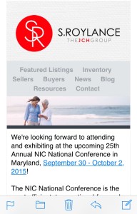
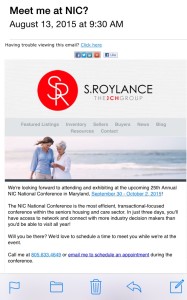
Example: This is a newsletter campaign we created for one of our clients who works in commercial real estate.
You want your email to look like this:
Not this:
2. Forgetting about branding
Your reader should be able to immediately recognize your business when your email arrives in their Inbox. You don’t want your audience wasting any time trying to figure who the message is from. You want them, instead, to focus on taking the action on what’s in the email.
Here are three easy ways to brand your emails:
- Be consistent with logo & branding colors: Your logo should be positioned at the top of your email and the colors you use should fit your brand.
- Use images of your business, products, and people: Include real images that show the work that you’re doing every day.
- Use consistent language: Use a consistent tone in the content that you write.
3. Using hard-to-read fonts
Adding too many different fonts will make your emails look messy and distract readers from responding the way you want them too. Keep this in mind:
- Number of fonts: Avoid using more than two different fonts in the emails you send out.
- Font size: Use 22-24pt for header text and 12-16pt for body copy.
- Amount of text: Constant Contact recently found that 20 lines of text results in the highest click-through rates.
“How To Design Cash Producing Emails For
Your Small Business or Non-Profit
(Even If You Have ZERO Design Skills Like Me!)”
Take The Next Best Step!
4. Adding the wrong colors
Using too many colors can also be distracting and make your emails look unprofessional.
Colors that are off brand and unrecognizable to the people who know your business can cause confusion and lead people to ignore or delete your messages.
Instead, try to stick to 2-3 colors that align with your brand.
Don’t know your exact brand colors? Tools like ColorPicker (available on Chrome) or colorPicker (available on Firefox), allow you to pull the exact colors on your website or in your logo. You can then enter the color value into your email marketing tool to match your template to your brand.
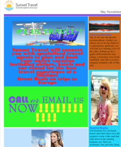
Example: This is a newsletter campaign was created for a travel agency.
You want your email to look like this:
Not this:
5. Forgetting to organize
You audience will typically scan your emails and make a snap decision about whether the message is relevant to them. If you want your emails to instantly connect with your reader, you need to make sure your content is well organized so that it’s easy to read.
Ideally, you’ll have one primary piece of information you want to get across to your audience and no more than 2-3 secondary messages. Your primary message should be the first thing people see when opening your email.
Start with a short header message that sets up the content people are about to read. The copy that follows should be clear and concise. Replace lengthy paragraphs with quick sentences that let people know what you’re doing, why it’s important to them, and what (ONE) action you’d like them to take.
6. Not using (or misusing) images
Your email should always include an eye catching image that pulls the reader in and makes them want to pay attention.
You can upload your own photos — of your staff, products, or place of business. Or select a stock photo that supports your message and fits your brand.
Be careful thought, not to overload your email with too many images.
A recent analysis of more than 2 million Constant Contact customer emails found that emails with 3 or fewer images result in the highest click-through rate.
7. Not adding relevant links and buttons
Your email should include at least one relevant link to drive people back to your online properties — like your website, blog, or social media profiles.
Be careful not to overcrowd your emails too many links. A recent analysis of Constant Contact customer emails found that after 5-7 links, additional links result in minimal additional click-throughs.
When including a link to your website, be sure to drive people to the most relevant page for the action you want them to take. For example, if you want someone to purchase a product, send them to that product page and not your site’s homepage.
What do you think? Are you making any of these mistakes?
Don’t panic. All it takes is a few simple tweaks to update your design and get better results with your email campaigns.
By making small changes to the design of your emails, you’ll have more people reading and interacting with your emails which means more sales and more success for your small business.
“How To Design Cash Producing Emails For
Your Small Business or Non-Profit
(Even If You Have ZERO Design Skills Like Me!)”
Take The Next Best Step!


